ArcGIS Dashboards: Display Multiple Visualizations on a Single Screen
In today’s data-centric world, organizations need more than spreadsheets and static reports, they need real-time, intuitive tools to visualize, understand, and act upon complex spatial data. ArcGIS Dashboards, a powerful web-based application developed by Esri, its offers an elegant solution by turning raw geographic data into dynamic, interactive dashboards. Across industries from public safety and utilities to transportation and business intelligence, ArcGIS Dashboard empower decision-makers with the tools they need to see the big picture on a single screen.
What is ArcGIS Dashboards?
ArcGIS Dashboards is a configurable, no-code web application that allows users to create dynamic dashboards using data from ArcGIS Online or ArcGIS Enterprise. It combines maps, charts, indicators, gauges, and lists into a cohesive, interactive interface that presents real-time, location-based analytics.
Dashboard data expressions are simply an arcade expression that returns a feature set. Using this expression, language authors can reconstruct data sets to power of any dashboard elements, and in turn those elements can help form an engaging and informative dashboard.
Core Features
- Real-Time Data Monitoring: Supports live data feeds and dynamic updates—ideal for emergencies, IoT monitoring, and operations.
- Interactive Elements: Allows filtering, zooming, selecting, and panning. Clicking on one component can trigger updates across others.
- No-Code Interface: Dashboards are built through a drag-and-drop interface—no programming knowledge required.
- Configurable Layouts: Flexible design to suit various devices—customized views for desktop and mobile platforms.
- Multiple Data Sources: Integrates maps, tables, feature layers, and real-time feeds across departments and systems.
- Arcade Integration: The Arcade scripting language enables custom calculations and advanced formatting within dashboard elements.
- Action Framework: Elements can be linked through actions—for example, selecting a map feature filters related charts.
- Easy Sharing: Dashboards can be shared publicly, within an organization, or kept private for internal use.
Types of Dashboards
There are many types of dashboards you can build with ArcGIS Dashboards.
| Type | Purpose | Audience |
| Operational Dashboards | Track field activities, resources, and logistics. | Managers, Field Teams |
| Strategic Dashboards | Monitor long-term performance and trends. | Executives, Policy Makers |
| Tactical Dashboards | Oversee project-level or department-level metrics. | Mid-level Managers |
| Informational Dashboards | Present public-facing data for awareness. | General Public |
Benefits
- Enhanced Situational Awareness: Visual dashboards offer a real-time overview of operations, making it easier to detect anomalies or changes quickly.
- Improved Decision-Making: Interactive, spatially informed visuals empower stakeholders to derive deeper insights and take timely actions.
- Increased Efficiency: Centralizing critical information on one screen eliminates the need for switching between systems and reports.
- Effective Communication: Dashboards translate complex data into clear visuals suitable for technical and non-technical audiences alike.
- Real-Time Monitoring and Alerts: Dashboards connected to live data streams can trigger alerts for key events, enabling proactive management.
Applications across Industries
| Sector | Use Case Examples |
|---|---|
| Public Safety | Monitor emergency response, resource deployment, real-time incident locations, and hospital availability. |
| Transportation | Visualize traffic conditions, track transit fleets, manage delays, and inform commuters. |
| Utilities | Track outages, manage water/ electric networks, and monitor asset performance. |
| Environmental Monitoring | Observe air/ water quality, weather data, and ecological trends. |
| Healthcare | Track disease spread, hospital capacity, and vaccination efforts (e.g. during COVID-19). |
| Urban Planning | Oversee zoning changes, land use, and permit processing. |
| Business Intelligence | Analyze sales performance, customer trends, and campaign outcomes. |
| Logistics & Supply Chain | Monitor fleet movements, delivery timelines, and inventory levels. |
| Crime Mapping | Identify incident hotspots and trends for law enforcement operations. |
ArcGIS Dashboards Tutorial
Step-by-Step Process to create a Dashboards:
Before you create a dashboard, verify that you are Sign in to ArcGIS Online web portal.
1. Click the app launcher button ![]() or Launch ArcGIS Dashboards in the header of the site.
or Launch ArcGIS Dashboards in the header of the site.

2. Click Create dashboard, and write the title for the dashboard.
Add Elements
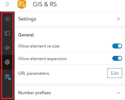
1. From the empty dashboard, click the Add element button ![]()
2. Choose an element from the drop-down list. (configure your element)
3. Once you have configuration is complete, click Done.
4. After you add an element to a dashboard, appear in the layout panel.
You can click the Options button. From the options menu, you can choose one of the following:
- Configure

- Duplicate
- Rename

- Delete
Create a Dashboard
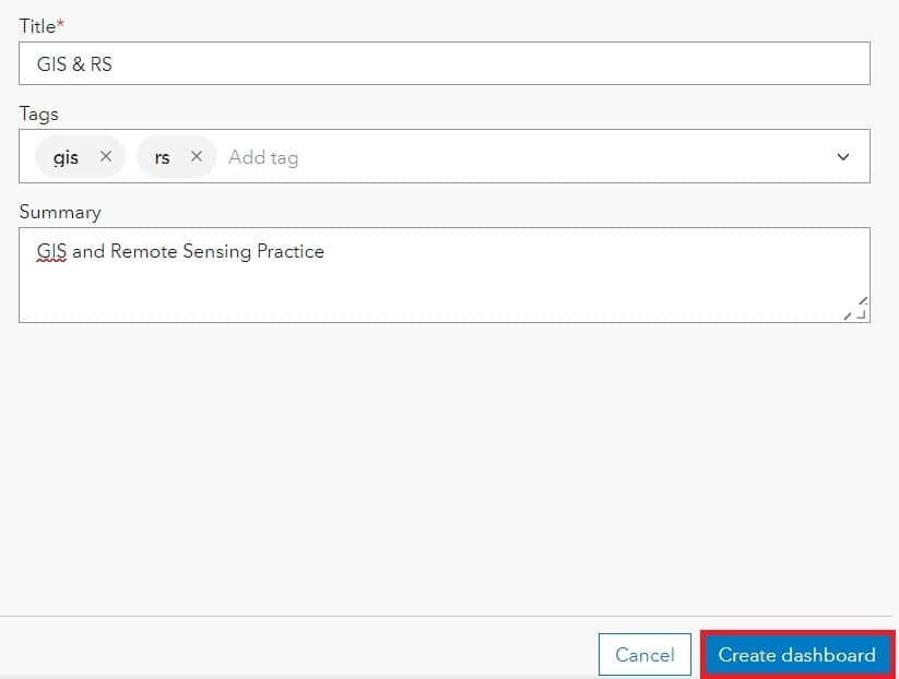
1. Click Create App then choose Dashboards.
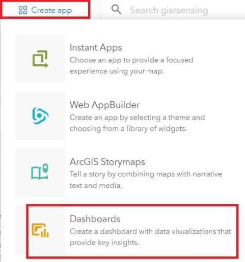
2. Enter the required information, like Title, tags, summary, etc. When all the fill completed, Click Create dashboard for finished.
Setting the Map Element
1. In the upper left corner of the map, to display a black bar. Move your mouse over the bar to reveal the menu. You can access all of an element’s settings via this menu.
2. Click the Plus button, and your project’s requirement features.
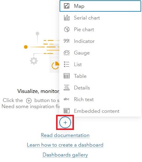
Popular Dashboard Elements:
| Element | Function |
|---|---|
| Map | Displays spatial data and patterns. |
| Indicator | Highlights key stats and real-time metrics. |
| Serial Chart | Shows trends over time using bar/line graphs. |
| Gauge | Illustrates progress toward goals. |
| List | Displays itemized, filterable records. |
Best Practices for Dashboard Design:
- Keep It Simple: Focus on clarity by avoiding overcrowding.
- Use Color Coding: Apply consistent, meaningful colors and icons for visual hierarchy.
- Optimize Performance: Use simplified datasets and avoid unnecessary real-time feeds.
- Design for the Audience: Match visual complexity with the audience’s needs.
- Test Interactions: Ensure filters and selectors work smoothly across elements.
- Highlight KPIs: Make key performance indicators prominent and easy to understand.
Limitations:
- Styling Restrictions– Limited advanced UI customization (fonts, layout spacing, etc.).
- Performance with Large Datasets– Dashboards may lag if not optimized for size and complexity.
- Licensing Requirement– Requires access to ArcGIS Online or Enterprise.
Conclusion
ArcGIS Dashboards serves as a cornerstone tool for any organization working with spatial data. By merging real-time analytics with powerful visuals, it offers a unified view of operations and trends, accessible to technical and non-technical users alike. Whether you’re a GIS analyst managing data or an executive making strategic decisions, ArcGIS Dashboard delivers the clarity and control necessary in today’s fast-paced, data-rich environment.
As data continues to grow in volume and complexity, the need for responsive, accessible, and interactive visualization tools will only increase, and ArcGIS Dashboards is leading the way.